Watches & Wonders 2026 Winners & Losers
- rogtwatches
- 4 days ago
- 6 min read

Every year the biggest watch brands come together in Geneva, Switzerland to showcase their new innovations in timekeeping. While some brands shined, others fell short. Here are my winners and losers from this year's Watches & Wonders.
WINNER: Rolex
As always, the poster child for the watch world delivered some exceptional pieces. Last year we saw the Rolex novelties leak prior to the trade show, but this year Rolex didn't leave it up to chance, teasing their new releases in the days leading up to Watches & Wonders, building the hype and keeping control in their hands.
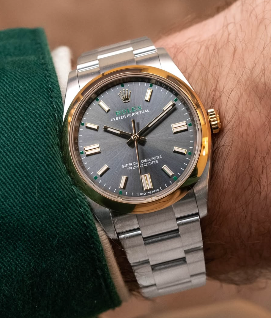
Rolex celebrates 100 years of the Oyster case, the first waterproof case, with a new two-tone anniversary edition Oyster Perpetual. This watch is growing on me the more I see it. This is how an anniversary edition watch is done right. They took their OP case and made small adjustments to highlight the 100-year feat without overpowering the timepiece. The "100 Years" labeling on the dial and crown is subtle, allowing the watch to stand on its own. I really like how Rolex identified what the OP collection was missing as a whole and folded that into this anniversary piece while also incorporating the classic Rolex touches. I'm referring to the addition of the gold bezel and crown, as the OP line was strictly steel up to this point, and the classic Rolex touches are the hints of green, which is Rolex's calling card.

Rolex also released a new green ombré dial to the Datejust lineup, which might be my favorite release of W&W 2026. I'm a huge fan of the green ombré Day-Date, but there's just a small problem of it being $43k, unfortunately out of my league. So when I saw Rolex released a similar dial on the Datejust, I was pumped. I'm really interested to see live photos and get it in person to see if the dial compares to the Day-Date, as the Day-Date ombré is really dark, almost all black with just a hint of green that can pop in certain lighting. Based on the images on the Rolex website, the Datejust seems to have more green, but it's hard to tell.
LOSER: Tudor
I'm really disappointed in Tudor this year. There was so much hype around Tudor's 100-year anniversary and they fell drastically short. This was 100 years as a brand, which many companies can't say they've achieved, yet to Tudor it seemed like just another year.

Tudor released the new Monarch as their celebration for 100 years, but there's no way to tell without doing some research first. It seems this watch was geared towards the watch enthusiast rather than the average joe. There are plenty of interesting aspects of this watch that give it potential for growth: the angular case design, the new two-link faceted bracelet, the Manufacture Calibre MT5662-2U movement with open display caseback, and the diamond hands. The two areas where it falls short for me are the papyrus-toned dial and the California dial markers, the mix of Roman numerals and Arabic numbers. The color isn't my style and the California dial's asymmetry throws off the balance of the watch. But those can be tweaked in upcoming releases, so I'm optimistic. The core components of the Monarch are there.

The rest of Tudor's updates were lackluster, not something you'd expect from a hyped-up 100-year anniversary. The "new" Black Bay 58 GMT really annoys me. Don't get me wrong, I like the watch, I have one myself, but all they did was add the five-link bracelet and pass it off as a new novelty. It's a weak attempt at innovation. Rolex's approach is better, where they have a core set of novelties for the year while still making small configuration changes alongside them. They don't try to pass off a bracelet configuration change as a new novelty, especially during such a historical moment.
What's even more annoying is that I can already predict Tudor doing the same thing with the new sapphire blue Black Bay 54. This watch was released on the three-link and rubber bracelet options. We know the Black Bay 54 case can accommodate the five-link bracelet since the BB54 "Blue Lagoon" is on it, so in the next year or two I can see Tudor releasing the five-link on the sapphire blue and pulling the same move.
Overall, what could have been a stepping stone into the next 100 years of Tudor's history has left us unsatisfied and wanting more.
WINNER: Zenith Chronomaster Sport Skeleton

I'm really impressed with what Zenith did here with the Chronomaster Sport, specifically the gradient sapphire dial which increases in opacity centrifugally. The dial reveals the brand's signature El Primero movement, which is beautiful to admire, but the gradient black on the edges keeps timekeeping legible, as the dark border provides the contrast needed behind the hour markers. A common criticism of the Chronomaster Sport is that it looks too much like the Rolex Daytona, and if you know about Zenith's and Rolex's history, you'd know that Zenith supplied the movement for the Daytona for a long time before Rolex started producing an in-house movement, so it's not so crazy that the two watches share a similar aesthetic. But the new gradient dial brings a unique twist that differentiates the Chronomaster Sport just enough from the Daytona to the point where, honestly, I think I'd choose the Chronomaster Sport.

LOSER: IWC Big Pilot’s Watch Perpetual Calendar Ceralume

This watch is comical to me and I don't understand what IWC was thinking. If there's a will there's a way, I guess. There are so many things I don't like about this watch I don't know where to begin. First off, it's massive — 46.5mm case diameter and 15.9mm tall, making this thing a giant block on even the largest of wrists. I think the reason IWC had to go so big was to salvage what little legibility there is on the dial. Not only is everything on the dial white, making it almost impossible to read, but it's also a perpetual calendar with four sub-dials, so the only way to make it work is to make it huge. The case is made from IWC's proprietary Ceralume luminous ceramic material, and sure, there's some innovation in the fact that they can construct a case out of this kind of material, but I don't see why you'd want a giant glow stick on your wrist for $76,300.

WINNER: Grand Seiko UFA Ushio 300 Diver
Last year Grand Seiko introduced the UFA, "Ultra Fine Accuracy," spring drive movement with its groundbreaking accuracy rating of +/- 20 seconds per year. Now Grand Seiko is expanding the movement into the rest of their catalog, specifically into the diver category.

The new Grand Seiko diver is pretty incredible. Aside from the updated movement, the most notable improvement is the case size. Previous iterations of the Grand Seiko diver came in at 44mm, but it has now been trimmed down to 40.8mm, bringing it in line with the general consensus for a dive watch. The rest of the package is equally well thought out: a titanium case and bracelet keep the weight down, the micro-adjust clasp ensures a proper fit, the ceramic bezel adds durability, and the Ushio dial, inspired by the patterns of shallow coastal waters, gives the watch a distinctive identity that goes beyond the typical dive watch aesthetic. I perfer the green dial over the blue, but both are equally stunning.
LOSER: Cartier Roadster

There's not much to say about this watch other than it's just plain ugly. The odd crown, the framed date window, and the case shape are all reasons why ending the 14-year hiatus on the Roadster came too soon. Some watches should stay in the past. This watch feels made for the posh fashionista hunting for a unique vintage-inspired piece, but what they end up with is a funky, unstylish watch that has plenty of better alternatives. What can I say? I'm a hater.
Final Thoughts
Overall, I'm honestly pretty disappointed in what was released this year. A lot of things didn't live up to the hype. There was plenty to celebrate, but it seemed like brands had their own agenda rather than rising to the occasion.
If you enjoyed reading, please subscribe to my email list and follow me on Instagram @runningongreektime


Comments